Thursday, January 13, 2011

December - Retouching Pictures + Calendar

'Tis the season for brownies! This post includes my picture retouching progress, as well as the final look of the calendar.

1.
Original


First of all,  i changed the colour of the table by selecting it with the Quick Selection tool and then the Hue/Saturation adjustment.


Also, i applied the Levels tool which i rather useful in producing a deep effect of contrast. You'll need to try and test with the values to know what you want. Then i used the usual Colour Balance and Curves Tool.

2.
Original

Final

This picture has been retouched with the Colour Balance tool, Levels tool and Curves tool. You can see that the deep colour of the chocolate gives it a rich and supreme feel compared to the original one.

3.


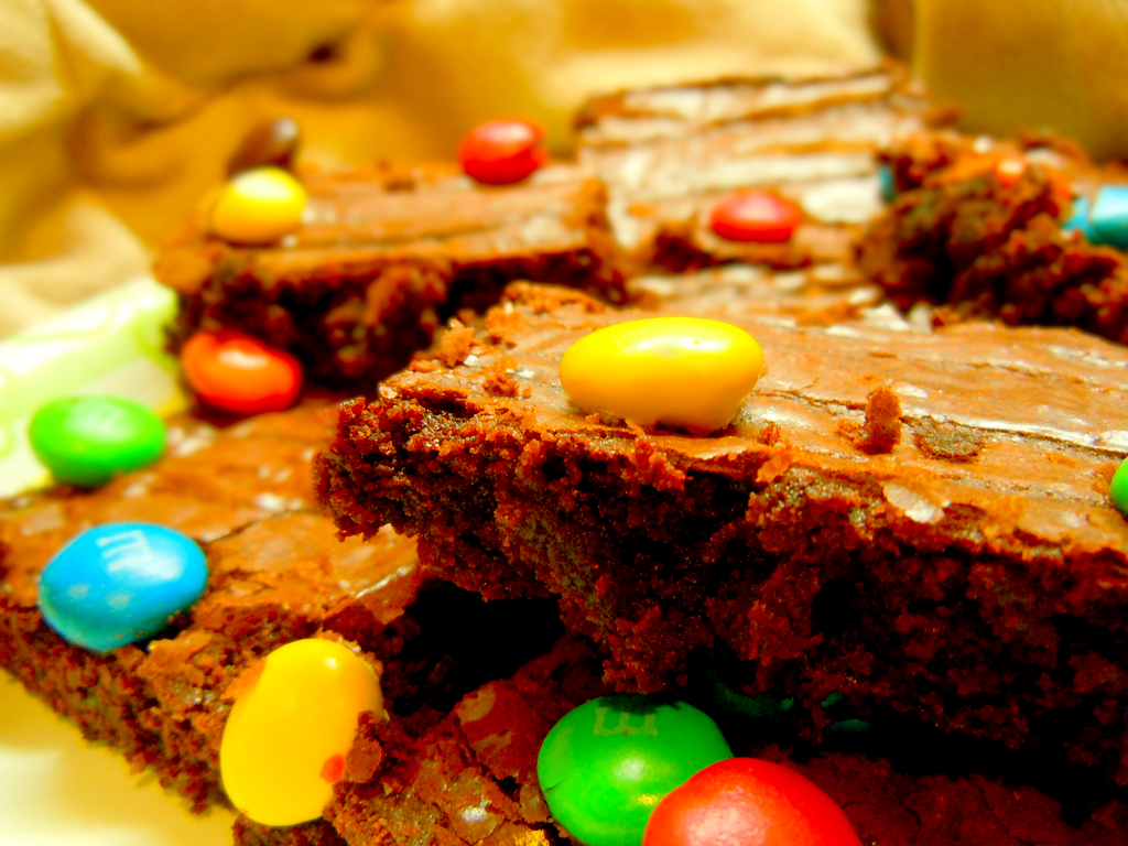
The first thing i did was to get rid of the crack of the yellow M&M with the Spot Healing Brush tool and Smudge tool. I also used the Spot Healing Brush tool to remove some unwanted bits and pieces on the other M&Ms because they are very distracting. After that, i continued with the Colour Balance tool as well as the Levels tool to make the picture brighter.

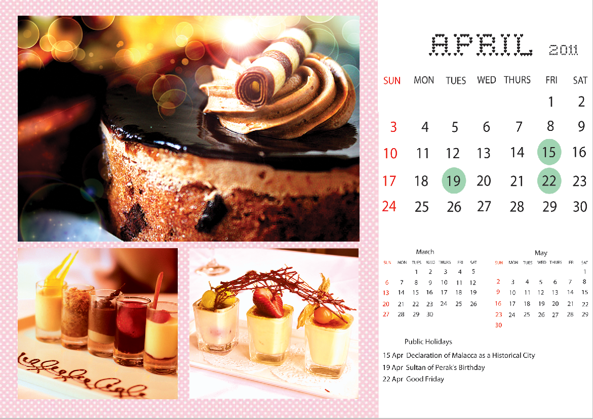
Put together, the complete calendar looks like this:


Credits:
http://www.flickr.com/photos/trackstar_816/
http://www.flickr.com/photos/bettycrockerrecipes/

November - Retouching Pictures

Now, i'll be showing you my work on the calendar assignment. For the month November, i chose tarts - fruit tarts to be exact. The programmes i used are Adobe Photoshop CS4 and Adobe Illustrator CS4.

1.
Original

Final


For this image, i used Layer Mask to select the tarts and change the hue and saturation of the background to a duller shade, making the tarts stand out more.


Also, i selected the strawberries with the Magic Selection tool and changed the vibrance to make the red more pronounced.

2.
Original

Final

This time, i used the Colour Balance tool, Brightness/Contrast tool (easier to use compared to Curves) and Curves to retouch the photo. Once again, the tools are used to manipulate the vibrance of the red raspberries to capture viewers' attention.

3.


As for this last picture, i applied the same Adjustments before, but with different values.

Credits:
http://www.flickr.com/photos/myfeasts/
http://www.flickr.com/photos/85916641@N00/
http://www.flickr.com/photos/mellow_stuff/

February with delicious TIRAMISU~ :3

February will be the month accompanied with Tiramisu.
Here are some of the steps of how i editing the pictures.
(Actually it is almost the same that how i did the editing on the previous one.)

Select Image> Adjustment> Brightness/ Contrast

Adjust the settings.

Select using Magic Wand Tool

select Blur More!

Select the strawberry by using Magic Wand Tool


And adjust the Brightness/ Contrast again

Adjust the leaves by using the same way as well

Select Dodge Tool

Highlight some of the part of the Tiramisu to make it looks more delicious! :D


SAME GOES TO THE OTHER 2 PICTURES!~ =)

Lastly, after PLACE all the pictures in the layout, right click on the layer and choose Blending Option 

Same setting with the January, Bevel and Emboss> Depth 330%; Size 40px; Highlight mode and Shadow mode are 55%

Every pictures do the same way and the calendar is DONE! :D

This is the final look of the February calendar!


Sources: Paranoid Android; OMG YUMMY SOUND "BITES" AND MISCELLANEOUS MUSINGS ABOUT YUMMY FOOD; BUTTER SUGAR FLOUR

Wednesday, January 12, 2011

April calender

1102701055 Heng Pei Ling
Picture 1

original


http://www.flickr.com/photos/abillionsmiles/4825955967/
final
                            -----------------------------------------------------------------
1. file > open  , choose the file
2. right click on the layer > choose duplicate layer > rename layer (sharpen tool ) > select sharpen tool  ( to sharpen the creme brulee to make it looks clearer )
3. duplicate layer > rename layer ( Gaussian blur ) > select magnetic lasso tool
4. use magnetic lasso tool to select the background ( a selection appear )
5. select > modify > feather 
6. feather radius ( 5 pixels )
7. filter > blur > gaussian blur ( to make the background blur )
8. radius 6.0 pixels
9. adjustments > brightness/contrast > brightness 0 , contrast 30 ( to enhance the colour of the picture )
10. duplicate layer > rename layer ( burn tool ) > select burn tool > opacity 50 % > range ( midtones) ( burn the dark area of the cream  which in the red circle to make it more darker )
11. duplicate layer > rename layer ( dodge tool ) > select dodge tool > opacity 34% > range (highlights) ( apply it on the cream which in the red circle to highlight the cream )
12. duplicate layer > rename layer ( gradient tool ) > select gradient tool > foreground colour ( black ) > press shift ( to make a straight line) + drag it on the background so the creme brulee will be the main focus
13. file > place the bokeh picture at the top left position > blend mode ( vivid light ) > opacity 100% , fill  62%  ( to add texture on the background )


bokeh picture > http://desktop-world.info/2009/05/bokeh/


   14. layer > layer mask > hide all 
15. select dodge tool > apply it on the position which the bokeh picture is placed until the texture appear ( to make sure only the wanted part is shown ) 
16. file > place the bokeh texture at top right position > edit > transform > flip horizontal > repeat the steps 14 & 15
17. filter > render > lens flare > adjust the flare center > brightness 120% > lens type 50-300mm
18. file > place > white dotted picture > place at  left side > blend mode (overlay) ( add effect to avoid the dark area looks dull ) 


white dotted picture > http://wanderingsoul-stox.deviantart.com/art/Texture-102-99823991?q=&qo=

19. right click on the layer > select rasterize layer
20. select eraser tool > erase the edges of the picture which in the red circle


Picture 2

original


http://www.flickr.com/photos/sutanto/3615951464/


1.  select curves > drag it to adjust
2. select color balance > tones ( midtones ) > cyan-red (+96) , magenta-green (+33) , yellow-blue  (-3)
3. select channel mixer > output ( cyan ) > cyan (+35), magenta (-30) , yellow (+1) , black (0) , constant (0)
Picture 3


original
final
1. select levels > mid tone 1.00 , highlights 193
2. select hue/ saturatihue -1 , saturation + 27 , lightness +1
3. select colour balance > tone(midtones) > cyan- red +96 , magenta-green +33 , yellow- blue  -3

------------------------------------------------------------------------------------

1. after finish editing those pictures , I drag all the pictures into the layout and place it correctly . Those pictures are not absolutely fixed the size , so I use rectangular marquee tool to make a selection > edit > cut ( cut the extra edges)

2. then I drag the calender which I make it from illustrator into photoshop and arrange it nicely .
3 . three of these pictures : right click on the layer > blending options > style (inner bevel) > technique (smooth) >depth ( 330 %) > size 40px > angle 120 > altitude 30 > highlight mode (screen),opacity 55% > shadow mode (multiply) , opacity 55% , apply it to all of those pictures.

FINAL