1102701055 Heng Pei Ling
Picture 1

 |
| Final |
 |
| 1. file > open |
 |
| 2. right click on the layer > select duplicate layer > rename it (sharpen tool ) |
 |
| 3. select sharpen tool > sharpen the cream pudding which in the red circle ( to make it look clearer ) |
 |
| 4. file > place > choose file > place the bukeh picture at the left side > edit > free transform > rotate 90 CCW > blend mode (overlay) > opacity & fill 100% layer > layer mask > hide all > select dodge tool > apply it on the position of the bukeh picture placed util the texture appear ( to add texture on the picture to avoid looks dull ) bukeh picture > http://s375.photobucket.com/albums/oo200/amity0park/AMV/Textures/?action=view¤t=bokeh_texture_5_by_H_D_STOCK.jpg&newest=1 |
 |
| 5. select levels > adjust it as shown in the picture ( to enhance the picture ) |
 |
| 6. select brightness / contrast > contrast 13 ( to increase the colour tones ) |
 |
| 7. file > place > place it at the left side > bled mode ( soft light ) > opacity 42% ( to add effect of the background) texture > http://dyingbeautystock.deviantart.com/art/trippy-purple-bokeh-107570023 |
 |
| 8. repeat the step 7 > resize it ( press shift + drag it - to maintain the original size ) to the full size of the cream pudding picture ( try to enhance the colour of pudding ) texture > http://www.flickr.com/photos/39212231@N04/3605677895/ |
 |
| 9. duplicate layer > rename layer ( gradient tool ) > select gradient tool > press shift ( to make a straight line ) + drag it at the top & bottom ( to make the whole picture look dramatic ) |
 |
| 10. duplicate layer > rename layer ( dodge tool ) > select dodge tool > apply it on the surface of the cream which in the red circle to make it more brighter ( to attract people ) |
 |
| 11. filter > render > lens flare > adjust the flare center > brightness 119% > lens type 50-300mm |
 |
| 12. file > place > place at right side > edit > transform > flip vertical > blend mode ( overlay) > select eraser tool > eraser the edge of the texture picture ( to add texture to the background) texture > http://saekaeru.deviantart.com/art/Texture-1-Watery-Snow-66546679?q=boost:popular+blue+texture&qo=27 |
 |
| 13 .duplicate layer > rename layer ( burn tool ) > select burn tool > burn the cream pudding in the red circle |
 |
| 14. deselect all the eye icons of the texture layers which locate at the left side of the layer's side > select quick selection tool > select the pudding which located at the back |
 |
| 15. filter > blur > gaussian blur > radius 8.0 pixels > ctrl+d to deselect the selection ( to make the pudding stand out which is in the front ) |
 |
| 17. duplicate layer > rename layer ( dodge tool 2) > apply it in the red circle ( to make it more brighter) |
 |
| 18. again , duplicate layer > rename layer (lens flare 2) > filter > render > lens flare > adjust flare centre > brightness 111% > lens type 50-300mm |
 |
| 19. create a new layer > select gradient tool > drag in the red circle ( to make the background darker ) |
Picture 2
 |
| original |
 |
| final |
 |
| 1. duplicate layer > rename layer ( dodge tool ) > use it over the pudding ( to make it brighter ) |
 |
| 2. duplicate layer > select gradient tool > drag it + shift ( to make a straight line ) at the top and bottom ( to make it more dramatic ) |
 |
| 3. select levels > shadows ( 19 ) , midtones ( 0.72 ) , highlights ( 255 ) |
 |
| 4. select brightness / contrast > contrast 16 |
 |
| 4. select colour balance > midtones > cyan - red +96 , magenta - green +33 , yellow - blue -1 |
Picture 3
 |
| original http://www.123rf.com/photo_7957417_pudding-flan-egg-food-sweet.html |
 |
| final |
 |
| 1. duplicate layer > select dodge tool ( to hightlight the pudding ) |
 |
| 2. duplicate layer > select gradient tool > drag in the red rectangle ( to focus on the main pudding ) |
 |
| 3. filter > render > lens flare > adjust the flare center > brightness 111% > lens type 50-300mm |
 |
| 4. select brightness / contrast > contrast 17 |
 |
| 5. select exposure > exposure 0.10 , offset -0.026 , gamma 0.87 |
------------------------------------------------------------------------------------
 |
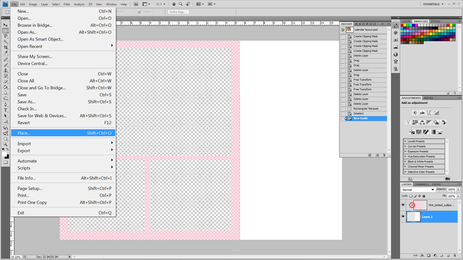
| 1. after edit all those pictures , I drag all the pictures into the layout & place it nicely. some of the pictures cant fixed it so I select rectangular marquee tool > edit > cut ( cut the extra part of the picture.) |
 |
| 3. three of these pictures : right click on the layer > blending options > bevel & emboss > style ( inner bevel) > technique ( smooth ) > depth 330 % > size 40px > angle 120 > altitude 30 > highlight mode (screen ) ,opacity 55 > shadow mode (multiply) , opacity 55 |
 |
| 4. select brightness/contrast > contrast 15 > press alt+click the line between 2 layers ( to create a clipping mask which in the red circle) to the main picture ( to enhance the color of the picture ) |
 |
| 5. I create the calender in illustrator , drag it into photoshop & place it |
6. For the final calender , I do not put the lens flare at the pudding's picture which at the right hand side because it will grab the attention away from the main pudding picture. So, i just teach how to put the lens flare if there is only 1 picture.
 |
| FINAL |